this will be a waaaaaay separated two parter sixer…
…where each one will be a sixer in it’s own right, but they’ll go together – just separated by almost as much time as star wars sequels.
moving on…
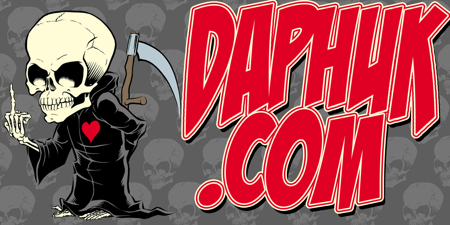
most of you might have noticed that the banner at the top of the site keeps changing. i think i mentioned a while back that for this, the tenth anniversary year of the whore, i’d change it up every month – although in october i actually did it weekly. sue me – i was trying to do month themes after the first couple, but i had so many halloween ideas and shit was hella slow at the shop so i went ahead and did four of ’em and swapped them out weekly(ish). so here’s a little about what i was thinking when i did these toppers, and after we close out the year in january i’ll just leave ’em on shuffle to where everytime you change screens it’ll change, and i’ll throw some new ones in the mix as i get inspired:
FEBRUARY

originally this was gonna be it – i just wanted something new, and i wanted it to be cartoonish almost to the point of looking like a lichenstein piece but without the dot pattern (google him if you don’t know his work). if you look at it and think it looks squished, it does! it’s cause i am still WAY novice at this photo shop and what i did was make it the normal size i wanted it and then shrunk it to the odd size that fits the top of the site. it looked more like this (and i still use it for wall paper):

MARCH

this is the only one i regret – i mean, for fuck’s sake, i’m irish and it’s st. patrick’s month! but no, i went russian. what the fuck was i thinking? well, i had just done a project (self-imposed) in the shop that had a russian theme so i’d downloaded what was supposed to be A (as in single) russian font but instead ended up with SIX. and i’ve always been a fan of the russian propaganda stuff so it just had to happen – poorly times as it may have been since…well…i should have done the irish thing, which came later.
APRIL

it’s hard to see, but the background on this one is actually a panoramic shot of sundance records taken by max wimmer, a guy i used to work with there. april first marked the last day the store existed, and it hit me pretty hard (see bits done around that time) because despite some slightly bad blood between me and the couple that owned it the whole was much greater than the sum of it’s parts for me and the store and what it represented in my past was larger than any beef between me and them. easily the most emotionally-based one i did.
MAY

some expected me to go all mom-a-fied on this since may has mother’s day in it, but after the emotional out pouring of the sundance thing the month before i figured i’d go more with the may party holiday, cinco de mayo…hence the mexican flag background…and for all those OUTSIDE the texas area who might not have seen the eagle emblem, it’s traditionally on everything that comes out of mexico and says “hecho en mejico”, or “made in mexico” in english. see, you can learn shit on here if you hang out long enough!
JUNE

while i admit this site in general is all about me i really felt the header on my birth month needed to really REALLY be all about me. i was in radio. i love old jamboxes. hence the background and gang tag looking font. to quote a post i put on leia’s fb wall when she asked if i used to breakdance because i knew the music that turbo had playing when he danced with the broom in breakin’, “in the 1980’s i was the fat kid with the radio, in the 1990’s i was the fat kid ON the radio…now i’m just the fat kid!”.
JULY

not to close out on a slightly weak note here, but it’s JULY. as in “the fourth of…” – tattered stars and stripes, slightly “we the people…” inspired font. this one was probably the most no-brainer one i did…
and we’ll cover august-january in january or february – unless the mayans are right and we never see those months, of course.


 Users Today : 8
 Users Yesterday : 16
 Users Last 7 days : 110
 Users Last 30 days : 408
 Users This Month : 374
 Users This Year : 1748
 Total Users : 15301
 Views Today : 9
 Views Yesterday : 33
 Views Last 7 days : 210
 Views Last 30 days : 947
 Views This Month : 879
 Views This Year : 3016
 Total views : 24502
 Who's Online : 0