as promised, a brief description of the six headers SINCE the year mark and BEFORE the “astro(label)whore series”…
…what can i say? i’ve been artistically inspired lately!

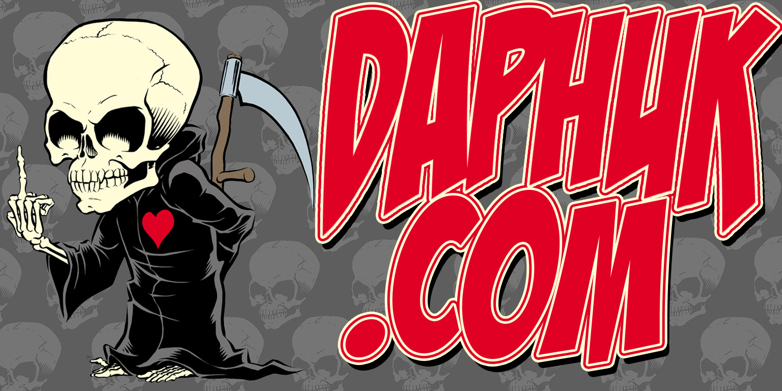
i’ve done the “ransom note” thing since high school – i used to buy binders that had the clear sleeve over them so i could make my own designs and shit, this is just the digital version. letters were boosted from the following logos (in order of appearance): atomic tattoo (where i work), rockstar energy drink, monster energy drink, reese’s peanut butter cups (most of you caught that one, i’d wager), torchy’s tacos (if you don’t know and you live in texas find out!), warner brothers (sue me, i needed a “w” and the whataburger one looked odd), oakley, starbucks (pure coincidence all the caffeinated logos, i swear!), and ed hardy. diamond plate thrown in the back and a clip art scroll and we were done!

i always wanted to do something where the letters showed through to something, and i thought it might bring some dough my way? i swear it’s just made me spend more, although i did do this just before the silver thing so maybe it worked? of course, with limited success i’d already done this with…

but i didn’t like this so i re-did it like this:

which i liked a lot better. this is actually the ufc’s chest ink, which is odd ’cause the office where i write all these actually has very similar very large birds flanking either side of the monitor, so as i write now i feel i’m nestled in my ladies cleevage – not a bad thing. went with the pale yellow letters ’cause in the pic this is lifted from she’s wearing a pale yellow dress (slightly visible if you check the bottom of the first shot at this)

so, while researching a whore topper that still hasn’t been done i came across the ferrari font and made some stickers for the shop that looked like ferrari badges:

which inspired this header – but as a bomb worked more for the shop, and the horse didn’t really work for me either, i wanted to go back to the site’s roots and do mudflap girls – finding some with skeletal detail just seemed all the cooler. i know the yellow’s a little off as compared to the original, but i was trying to match the yellow in the skeletons…

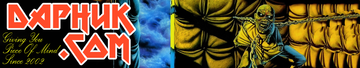
i had downloaded this font ages ago for something i was gonna do for the ufc although i have no idea what…i came across it when researching lettering for tattoos and shit. anywho, i then stumbled on this image as graphics for a story on an “offensive” (in quotes ’cause i wasn’t offended) billboard in australia, and here we were.

this was actually supposed to be part of the “astro(label)whore” series that kicks in to rotation today, modeled off “von dutch” shit, but most people have forgotten the brand, it didn’t make that big a splash, and when i looked for images i came across these classic hot rod pinstripe designs, which i loved, and i had their lettering already loaded into my notebook, so this came together cleanly, and in about five minutes (did you really think these would be laborous?)
 Users Today : 12
 Users Yesterday : 9
 Users Last 7 days : 74
 Users Last 30 days : 388
 Users This Month : 313
 Users This Year : 1687
 Total Users : 15240
 Views Today : 23
 Views Yesterday : 23
 Views Last 7 days : 177
 Views Last 30 days : 981
 Views This Month : 769
 Views This Year : 2906
 Total views : 24392
 Who's Online : 0